

A growth team launches a new landing page for a subscription offer. The hero looks sharper, the headline earns more attention, and more visitors click the call to action. But fewer complete checkout, payment approvals slip, and customer support starts fielding questions about what subscribers signed up for. The page won the click test. The business lost the sale.
That's the trap with A/B testing landing pages as if they were only a copy or design exercise. For DTC and subscription merchants, a test has to protect the whole path from first impression to approved payment, and account for what happens after the first charge. A higher click-through rate is useful diagnostic information. It isn't proof of more revenue.
Why Most Landing Page Tests Lose Money
A new hero image and headline can lift CTA clicks while reducing completed payments. That usually happens when a test is judged by the first action visitors take, not by whether they understand the offer, can use their payment method, and complete checkout. The variant may attract attention without bringing in more customers.
A click measures intent at one point in the journey. It does not show whether an issuer approves the charge or whether a subscriber understands the renewal terms. If variant assignment is not connected to downstream events, a team can call a page the winner even as approved payments fall.
Checkout friction makes that gap consequential. Baymard's longitudinal ecommerce research reports average cart abandonment of 70.19%, based on 14 years of tracking, showing why a landing-page variant can win on clicks and still lose completed orders later in checkout (Baymard's checkout usability research). A click-only dashboard hides this trade-off.
A landing-page winner is only a business winner if it improves the outcome the business needs.
Tie each experiment to a primary event, such as completed payment or a qualified subscription. Use CTA clicks and checkout starts to diagnose behavior, not to overrule a decline in approved payments, completed orders, or subscription quality. When paid creative and landing pages are tested together, a structured approach can help teams find winning ads faster, while keeping the commercial result in view.
Define what the test changes: offer framing, headline, imagery, or call to action. Then judge the result against a business metric, not personal design preference. In Google Website Optimizer's historical Moishe's Moving Systems case, the company compared promotional offers. The $100-off message converted roughly 50% higher than competing offers, and the best-performing imagery was associated with a conversion-rate increase of more than 60% (Google's Moishe's case study). Those results are not a template to copy. They show why a test should measure the full proposition and the customer behavior it produces.
Designing a Test You Can Defend
A landing-page test needs a written decision rule before traffic enters either variant. Record the primary conversion event, baseline rate, minimum detectable effect, significance threshold, and target power. Without those choices, a team can keep checking results until a temporary swing looks like a reason to ship.
Set the event and the baseline
For a subscription checkout page, choose one primary event tied to the business result. Completed payment fits a test focused on approved initial charges. A qualified subscription may be the better measure if sign-up details or eligibility also determine customer value. Revenue per visitor can help compare different offers or payment mixes, provided tracking is consistent and the metric has a clear definition.
Calculate the baseline from the same event and eligible audience planned for the experiment. If 5% of visitors complete the chosen event on the current page, that rate anchors the sample-size estimate. CTA clicks are easier to collect, but they are not a substitute for a payment or subscription baseline.
The minimum detectable effect (MDE) is the smallest improvement worth detecting. Set it around the commercial decision, not the smallest lift you hope to see. A two-arm test designed to detect a 20% relative improvement from a 5% baseline to 6% needs roughly 15,000 visitors per variant under conventional fixed-sample assumptions with 95% confidence and 80% power, according to Kissmetrics' sample-size guidance. A smaller MDE requires substantially more traffic. For a low-volume page, testing a tiny hoped-for gain may not be practical.
Define the decision rule before launch
A common planning convention is 95% confidence and 80% power. Confidence sets the significance threshold; power describes the test's ability to detect an effect of the planned size. Keep secondary measures, such as CTA clicks or checkout initiation, as diagnostics. They can help explain behavior, but they should not overrule the primary outcome once the test is live.
| Planning input | What it controls | Typical default for subscription pages |
|---|---|---|
| Primary conversion event | The business outcome being compared | Completed payment or qualified subscription |
| Baseline rate | The starting point for sample planning | Current rate for the same event and audience |
| Minimum detectable effect | The smallest worthwhile difference | A commercially meaningful change the traffic can detect |
| Significance threshold | How much evidence is required to reject chance variation | 95% confidence, or α = 0.05 |
| Statistical power | The chance of detecting the planned effect if it exists | 80% |
| Traffic allocation | Whether both variants get comparable exposure | Even random assignment between two arms |
For another perspective on planning and test setup, review these A/B experiment best practices. After setting the plan, assign visitors randomly and evenly, and keep each visitor's assignment consistent. Exclude bots, internal traffic, and duplicate identities. Connect exposure records to the journey through CTA click, checkout, purchase, refund, and relevant subscription-quality events. For the primary binary outcome, use a two-proportion z-test or chi-squared test. Track refunds and subscription quality as guardrails too, so an apparent payment lift does not conceal weaker customer outcomes.
Client-Side vs Server-Side Assignment
The visitor's assignment method can alter what the experiment measures. A client-side tool usually runs in the browser after the page begins rendering. It's often straightforward to add, but the delay can create a visible flicker, and browser-side scripts may be blocked or lose their stored assignment. If one variant appears after a delay, or visitors see a consent banner before the experiment records exposure, the denominator can become inconsistent.
Server-side assignment decides which variant to serve before the page renders. Server-side tracking records interactions on the merchant's own servers and is less exposed to ad blockers, browser tracking prevention, and short client-side cookie lifetimes (Omniconvert's explanation of cookieless personalization). It can reduce flicker and give the merchant more control over assignment, but it doesn't make a test automatically accurate. If the assignment record can't be joined to a consent state, traffic source, device, checkout, and payment result, the analysis can still be biased.
| Method | Where the decision happens | Main advantage | Common risk |
|---|---|---|---|
| Client-side | In the visitor's browser | Quick to implement for visible page changes | Flicker, blocked scripts, or lost browser storage |
| Server-side | On merchant infrastructure before render | Consistent delivery and control over assignment | Incomplete joins can still distort measurement |
For checkout and subscription experiments, persist the assignment from landing-page exposure through checkout and, where relevant, renewal. Log exposure at the edge, then connect that record to payment authorization and later outcomes. Report intent signals such as CTA clicks alongside completed-payment metrics, and disclose how consent choices or blocked scripts affect the population you can observe.
Neither setup fully resolves cross-device journeys on its own. A visitor can arrive on one device and pay on another, so teams need a clear identity and attribution policy rather than assuming every browser session is one continuous customer. The practical difference between the approaches, including where each can fail, is worth reviewing against your implementation in Tagada's server-side versus client-side overview.
Speed, Layout Shift, and the Hidden Cost of a Pretty Variant
A visually stronger challenger can also be a slower page. A larger hero image, embedded video, or third-party review widget changes loading behavior, even if the experiment was meant to test only creative. On mobile or a weaker connection, the page may shift after render or delay the moment a visitor can interact. If the team records only the headline and conversion rate, it may credit the wrong change.
Vodafone's controlled comparison gives a reason to treat performance as part of the experiment: the optimized page had a 31% better Largest Contentful Paint score, and faster-than-average visits were 34% more likely to convert. Mobile visits with faster LCP were 27% more likely to proceed toward conversion (Conductor's page-speed resource). Those figures don't prove that every faster variant will win. They show why loading performance can't be treated as an irrelevant technical detail when comparing pages.
If the challenger changes both the message and the loading experience, you haven't tested only the message.
Put performance guardrails on the test card: LCP, interaction latency, layout shift, error rate, and checkout initiation. Review results by device and connection quality, so a desktop improvement doesn't conceal a mobile regression. If the page change also alters the payment experience, check whether visitors can reach the expected payment method and continue through checkout.
A practical approach is to keep assets lightweight, avoid unnecessary scripts, and preassign or server-render variants where the implementation supports it. Don't declare a creative winner just because it produces more early clicks when the same variant delays checkout or causes more errors. For page-level design decisions, use a broader landing-page best-practices checklist alongside the performance data.
Hypothesis Templates and Test Ideas That Hold Up
A useful hypothesis connects an observed leak to a specific change and a payment outcome. “Make the headline punchier” gives the team no clear audience, expected behavior, or decision rule. Write down what visitors do now, what the variant changes, and which business result should move.
Because we observed [behavior], changing [element] for [audience] will produce [outcome], measured by [metric].
This keeps the test tied to a customer problem instead of a preferred design. It also puts completed payment ahead of click-through rate: a click can rise while orders stay flat.
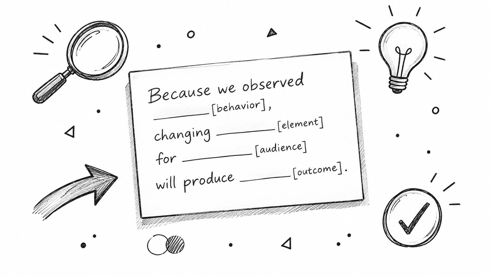
Use these starting points for DTC and subscription offers:
- Value framing: If paid-search visitors click an offer but leave before paying, test a benefit-led headline against the current one. Keep the offer and traffic allocation consistent, then measure completed payment. A headline that earns more clicks but not more payments has not improved the commercial outcome.
- Total-cost disclosure: If visitors reach checkout without knowing the amount due, show the full payable amount earlier and measure completed orders. Baymard reports that 14% of US online shoppers abandoned checkout because they couldn't see the total order cost upfront (Baymard's payment UX research). Isolate price disclosure from headline and payment changes so the result points to a usable next step.
- Payment-method exposure: If customers don't see a preferred option until late in checkout, test showing accepted methods earlier. The same Baymard research found that 10% of US online shoppers abandoned checkout because their desired payment option wasn't available. Treat payment visibility as its own hypothesis, and measure approved payments or revenue per visitor rather than assuming a broad checkout redesign will solve the problem.
- Trial and renewal clarity: If unclear terms lead to support contacts, refunds, or disputes after the first charge, make trial length, renewal timing, and cancellation terms easier to find. Track completed payments alongside cancellations, refunds, renewal outcomes, and disputes. A front-end lift can still harm subscription quality if customers misunderstand what they agreed to.
Keep payment preference separate from payment failure. Adding an alternative method may help someone whose preferred option is unavailable, but it won't necessarily resolve an issuer decline. A narrow hypothesis makes the result actionable.
With limited traffic, prioritize observed leaks close to payment, where a change has a plausible effect on completed orders and enough volume to measure. Defer cosmetic tests when traffic noise or downstream checkout friction would make the result hard to interpret. Tie each variant to the payment outcome it is meant to improve.
Reading Results Without Fooling Yourself
A statistical-significance dashboard isn't a launch decision. Read the conversion counts in each arm, the absolute difference, the confidence interval, and how long the test has run. A relative lift can sound impressive while representing a small absolute change, and a confidence label doesn't tell you whether the test had enough planned traffic or whether its assignment was sound.
Wait for the sample and duration set in the plan. A flat result early in the test isn't a reason to stop, and a temporary uplift isn't a reason to ship. Keep the analysis focused on the primary metric; repeatedly checking unplanned audience segments increases the chance of finding a pattern that won't hold when the team rolls it out.
For subscription and high-risk merchants, the guardrails need to continue beyond the first payment. Visa and Mastercard's program guide lists a standard threshold of 100 chargebacks plus a 1% chargeback-to-sales ratio, and an excessive threshold of 500 chargebacks plus a 2% ratio (Moneris' chargeback risk program guide). Treat dispute rate, refund rate, cancellation, and renewal quality as rollout checks, especially when a variant changes trial or rebill terms.
A winner should improve the primary outcome without breaching the agreed guardrails. If results are inconclusive, document that and use the funnel diagnostics to shape the next test. A reliable event taxonomy makes that review easier; teams can use ecommerce analytics practices to keep the measurement definitions consistent across landing pages and checkout.
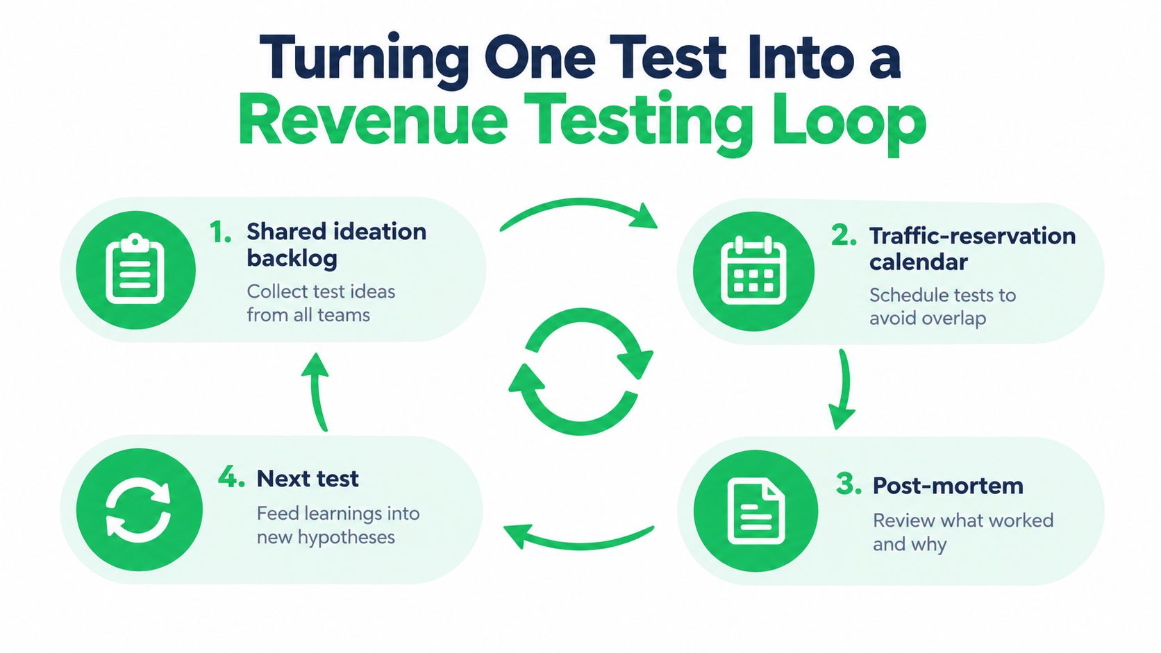
Turning One Test Into a Revenue Testing Loop
A landing-page win only matters if it improves completed payments without harming payment quality. Build the next experiment from what the last one established, and keep the record useful to the people who own checkout, routing, and customer messaging.
Use one shared backlog entry per hypothesis. Record its hypothesis ID, the customer friction it addresses, the page and checkout changes, the server-side assignment method, the primary outcome, and the guardrail results. Add the decision date and whether the team shipped, rejected, or retested the variant. Keep the evidence and context together, so the next test can build on the learning rather than just copy the creative.
Reserve traffic when tests overlap, and review the full payment path before rollout. A landing-page change can lift sign-ups while lowering completed payments or weakening subscription quality. Keep one performance guardrail active, then schedule a payment-quality review before expanding a winner.
Tagada brings checkout, payment routing, messaging, and growth tools together. TagadaStudio supports landing-page building and A/B testing, while TagadaPay supports payment orchestration. If you're connecting page experiments to completed payments and subscription outcomes, visit Tagada to see how its revenue orchestration tools fit your testing workflow.