

Baymard Institute's global benchmark puts average cart abandonment at 70.19%, meaning roughly 7 out of 10 shoppers who add an item to a cart don't complete the purchase. The figure has remained stubbornly close to 70% for well over a decade, despite better interfaces, faster devices, and more payment innovation. Checkout page optimization isn't cosmetic work. It's revenue recovery at the point where buying intent is highest.
A checkout can look polished and still lose buyers after they press Pay. Forced registration, unclear declines, failed wallet redirects, missing local methods, and renewal failures often sit outside the standard UX review. The strongest approach treats checkout as a connected system, from the first field to authorization, fulfillment selection, confirmation, and recovery.
Why Checkout Is the Biggest Conversion Leak
The cart-abandonment baseline changes how a merchant should prioritize work. If most shoppers who add products never reach a completed order, improving acquisition alone can send more expensive traffic into the same leaky process. A small improvement in completion can matter materially because it applies to existing purchase intent rather than requiring another visit.
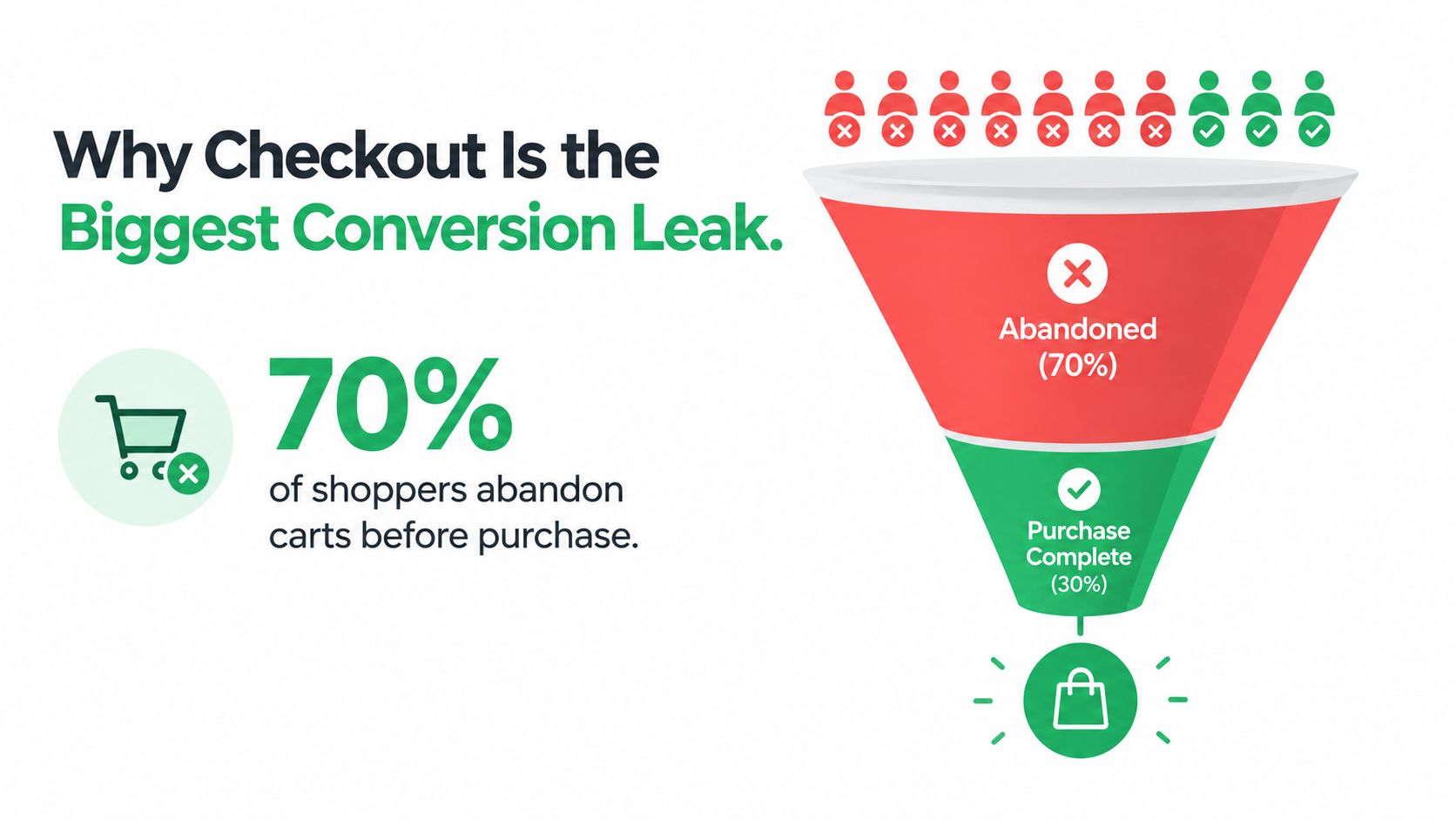
Baymard's research line is influential because it aggregates independent studies and has been updated over time. Its 70.19% global average is best understood as a structural benchmark, not a forecast for every store. Your category, traffic mix, device mix, shipping model, and payment coverage will change the actual result, but the underlying lesson holds: checkout friction remains a major conversion leak. See this checkout abandonment rate analysis when setting a baseline for your own funnel.
The first diagnostic question shouldn't be, “How do we make the page prettier?” It should be, “Where does the payment journey fail?” A buyer may abandon before entering a card, after a validation error, during a bank redirect, or after an issuer decline. Those states require different fixes, and a single checkout abandonment number hides them.
Separate visible friction from invisible failure
Visible friction includes long forms, surprise costs, weak mobile layouts, and unclear progress. Invisible friction appears after submission, when a customer sees a generic error, waits through an uncertain redirect, or assumes an order failed even though the payment eventually clears.
Practical rule: Measure checkout as a sequence of states, not as one page view.
The commercial case for fixing Shopify checkout friction is therefore broader than reducing clicks. Merchants need to expose totals early, preserve entered information, support appropriate payment methods, and make every failure recoverable. Treating those elements as one revenue system creates a better optimization backlog than copying a competitor's layout.
Streamlining Forms to Reduce Input Friction
Form reduction is usually the highest-impact area to start with, but “shorter” isn't the same as “easier.” Removing a field helps only when the remaining fields are clearly labeled, correctly typed, easy to autofill, and validated before the customer reaches the final button.
Independent industry summaries cite testing in which reducing checkout fields from 15 to 9 was associated with a 35% higher completion rate, and single-page checkout showed a 21.8% advantage over multi-step flows across 147 sites. These figures come from the checkout optimization research summary, and they should guide hypotheses, not replace testing on your own traffic.

Start with a field audit. For each input, ask whether it is required to authorize, fulfill, support, or legally document the order. Remove decorative or redundant questions, combine fields where your operation allows it, and keep optional information collapsed rather than demanding it upfront.
Make the shortest path reliable
Use browser autofill with accurate field attributes for name, address, email, and telephone information. Enable address autocomplete where it reduces typing, and use the correct mobile keyboard for email, telephone, and card inputs. These details don't look dramatic in a design review, but they reduce correction work and input mistakes.
Inline validation should explain the problem beside the relevant field. “Enter a valid email address” is more useful than a generic message at the top of the page. Preserve all valid data after an error, and move focus to the first unresolved field without forcing the customer to search the page.
Single-page checkout works well when the content is organized into clear sections, the order summary remains available, and the browser doesn't struggle with validation. A multi-step flow can be better for complex fulfillment, multiple delivery choices, or orders that need careful review. The choice should follow customer and operational complexity, not a blanket preference.
Instrument field-level abandonment
Track focus, completion, validation errors, and exits for each field. Compare mobile and desktop behavior, then examine whether a compressed design creates more errors even as it reduces scrolling. The same research summary reports 67% higher completion in reported testing for mobile-optimized checkouts using larger tap targets, simplified forms, and native autofill, which reinforces the need for device-specific tests.
Don't remove fields blindly. A shorter form that produces incorrect addresses, failed risk checks, or support tickets has shifted the cost rather than improved the customer journey.
Payment Method Orchestration and Routing
Payment-method optimization has two layers: selection, which determines what the customer sees, and orchestration, which controls how the transaction moves through processors, wallets, acquiring relationships, retries, and recovery paths.
A static row of card and wallet logos handles selection only. Baymard-derived coverage in Primer's payment abandonment analysis reports that 13% of online shoppers abandon when their preferred payment method isn't available. Local and device-appropriate payment presentation therefore matters, particularly for international stores.
Compare static and adaptive payment stacks
| Approach | What it does well | Where it breaks down |
|---|---|---|
| Cards only | Familiar and broadly available | Adds manual entry and misses wallet preferences |
| Every method everywhere | Maximizes visible choice | Creates clutter and may expose irrelevant methods |
| Market-specific display | Matches country, currency, device, and buyer context | Requires clean rules and reliable payment data |
| Orchestrated routing | Selects processors and recovery paths based on transaction conditions | Needs monitoring, fallback logic, and operational ownership |
The appropriate method can vary by country, device, order value, subscription status, and risk profile. Benchmark coverage in the payment-method research cited above places digital wallets at roughly 49% to 56% of global ecommerce transaction value in 2025. That does not require placing every wallet above the card form. It calls for payment presentation that reflects where and how customers purchase.
Stripe-reported figures cited in checkout conversion statistics associate at least one dynamically surfaced, relevant payment method beyond cards with a 7.4% average conversion increase and a 12% average revenue increase. Eligible Apple Pay checkouts were associated with a 22.3% average conversion lift. Treat these figures as directional evidence for a controlled test, then review margin, disputes, authorization rates, and settlement effects before expanding the setup.
Route the transaction, not just the button
A routing layer can select an available processor by region, card type, currency, or order value. It can retry after a soft decline, switch paths during a processor outage, and record whether a customer abandoned a redirect or received an issuer decline. Those records make post-submit failures diagnosable instead of leaving every unsuccessful payment in one generic conversion metric.
Dynamic payment routing supports this kind of decision-making. The value lies in keeping the customer-facing experience simple while the payment infrastructure makes better choices underneath it. Set clear fallback rules, assign operational ownership, and monitor authorization, failure, and recovery outcomes by route.
Optimizing Speed and Post-Submit Recovery
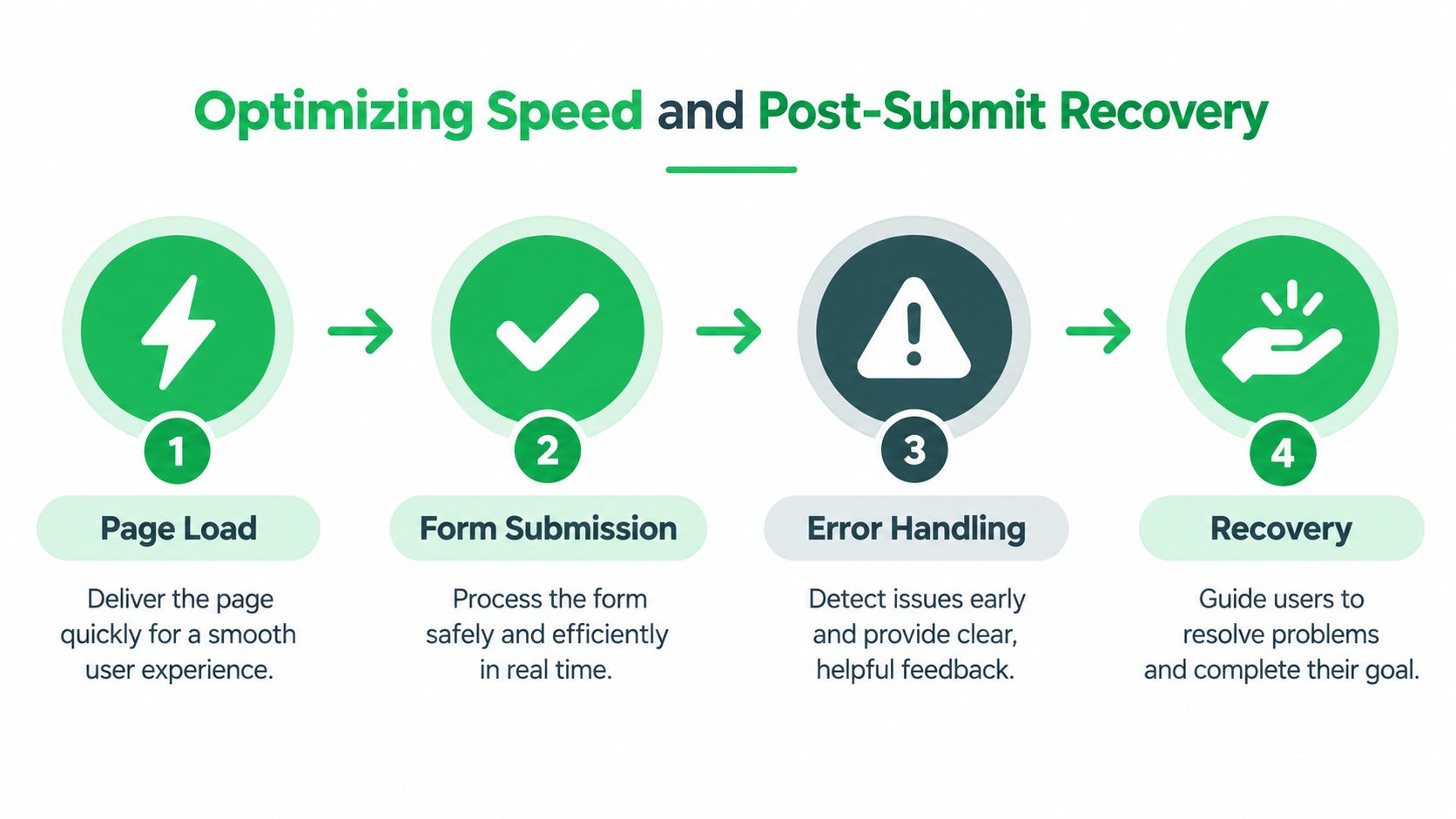
A fast checkout can still fail after the customer submits. Page performance matters, but speed should be measured across the full transaction: rendering the form, validating inputs, opening a wallet or bank redirect, receiving the processor response, displaying the result, and recovering from failure.
One cited 2025/2026 benchmark says conversion can fall by as much as 47% when checkout takes longer than 90 seconds, as reported in Shopify's ecommerce checkout guidance. The practical response is to reduce unnecessary scripts, keep payment components lightweight, avoid blocking validation, and test on realistic devices and connections.
Treat checkout as a stateful system
Your analytics should distinguish at least these outcomes:
- Form failure: A required field or validation rule prevented submission.
- Processor decline: The issuer or payment provider rejected the attempt.
- Redirect interruption: The buyer left, timed out, or returned without a usable result.
- Credential failure: A saved card, token, or wallet credential expired.
- Customer cancellation: The buyer intentionally stopped after reviewing the final step.
Each state needs different copy and a different next action. A declined card should offer another method or a retry path. An interrupted redirect should explain whether the order exists and provide a safe way to resume. A successful payment should lead to an unambiguous confirmation page, not a spinner that leaves the customer guessing.
Baymard's 2025 benchmark coverage reports that 62% of sites don't make guest checkout the most prominent option, while 64% of leading ecommerce sites were rated mediocre or worse in checkout UX. The same coverage highlights uncommon adaptive errors, fulfillment explanations, and required-field guidance. Those gaps show why post-submit recovery deserves the same attention as initial page speed.
Subscriptions add another recovery layer. Dunning combines automated retries with customer notices and an update-payment link when a renewal fails. The PayPal and comScore checkout report also notes that trials, long billing cycles, supplements, software, and coaching can create higher-risk underwriting conditions, where rolling reserves and tighter chargeback limits may apply.
<iframe width="100%" style="aspect-ratio: 16 / 9;" src="https://www.youtube.com/embed/85v1H-Gw4BI" frameborder="0" allow="autoplay; encrypted-media" allowfullscreen></iframe>
Building for High-Risk and Subscription Models
A standard ecommerce checkout assumes that a successful card authorization is the end of the problem. High-risk and subscription businesses can't make that assumption. They need to manage approval quality, fraud signals, recurring credentials, chargebacks, reserves, processor continuity, and customer communication as one operating model.
High-risk doesn't mean every transaction should be blocked. It means the merchant needs a risk-aware path that can distinguish a legitimate customer from a suspicious pattern without turning every uncertain payment into a dead end. A multi-processor setup can support continuity, but only when routing rules, data consistency, and fallback behavior are controlled.
Recurring revenue needs recovery by design
A rebill failure may reflect an expired credential, insufficient funds, a temporary issuer response, or a customer who needs to update payment details. Retrying the same request without context can frustrate customers and increase unnecessary declines. A better dunning workflow combines timing, customer-friendly notices, secure update links, and payment-method alternatives.
For higher-risk categories, underwriting constraints also influence the checkout experience. Rolling reserves and chargeback limits affect cash flow, while excessive disputes can threaten processor relationships. Merchants evaluating risk operations can use guidance on how to reduce excessive chargeback volume, then connect those controls to accurate product descriptions, refund policies, customer support, and post-purchase messaging.
Keep the operating layer unified
Tagada is one option for merchants that need an ecommerce operating layer combining checkout, payments, messaging, growth tools, subscription management, dunning, multi-processor routing, server-side tracking, and chargeback-aware risk handling. Its TagadaCheckout can adapt storefront flows, while TagadaPay supports routing across processors such as Stripe, Adyen, and NMI or native processing with smart retries and local methods.
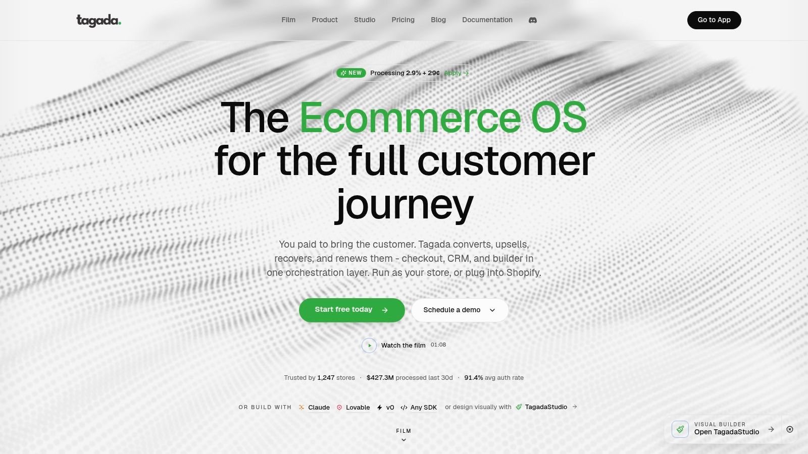
The strategic point is larger than a product choice. When checkout events, payment outcomes, customer messages, and subscription status live in separate systems, the recovery loop becomes slow and incomplete. A unified event model lets the merchant respond to actual payment states instead of sending generic reminders to everyone who failed to complete an order.
Implementing a Continuous Testing Strategy
Checkout page optimization should run as a controlled operating process, not a redesign that ends at launch. Start with a baseline for completion, abandonment, payment errors, time to complete, and average order value. Then segment those measures by device, country, payment method, new versus returning customer, and one-time versus recurring purchase.
A useful testing sequence is simple:
- Choose one failure or friction point. For example, make guest checkout more prominent, remove a non-essential field, or add a relevant wallet for one market.
- Write a specific hypothesis. State which customer behavior should change and which guardrail must remain stable.
- Change one primary variable. Avoid bundling a new layout, new copy, new payment method, and new trust treatment into one test.
- Track the full outcome. Measure completed orders, authorization results, error types, refunds, disputes, and support contacts.
- Roll out cautiously. A result that improves clicks but worsens payment quality isn't a successful checkout experiment.
Industry guidance commonly recommends testing one checkout variable at a time, including guest checkout, form fields, trust badges, and payment methods, while monitoring completion, abandonment, and payment errors. The A/B testing tools guide can help structure the experiment layer, but the measurement design matters more than the interface used to launch a variant.
Use server-side events for payment truth
Browser analytics can miss blocked scripts, redirect transitions, and delayed processor responses. Pair client-side funnel events with server-side payment events, order creation, fulfillment status, and subscription outcomes. Reconcile those records so the team can distinguish a customer who never submitted from one whose payment succeeded but whose confirmation page failed to load.
Review tests by segment rather than relying only on an overall average. A wallet may help mobile customers in one country while adding clutter elsewhere. A shorter form may improve completion for new buyers but create address problems for international orders. The winning version is the one that improves profitable, reliable orders across the segments you serve.
Tagada brings checkout, payment routing, subscription management, dunning, messaging, and server-side tracking into one orchestration layer for merchants that need more than surface-level UX changes. Visit Tagada to explore a checkout and payment setup built around recovery, recurring revenue, and reliable transaction execution.