

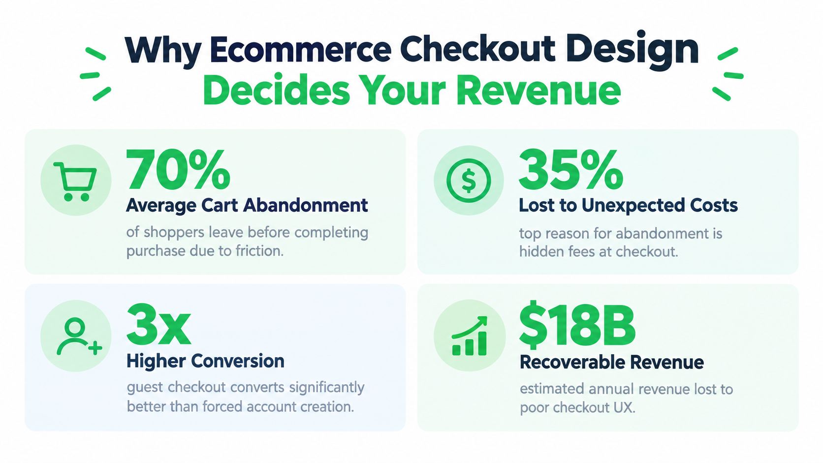
Around 7 in 10 shoppers who start the cart or checkout flow leave before they buy, based on Baymard Institute's long-running benchmark of global cart abandonment at 70.19% and its 2026 benchmark of 70.22% from an average of 50 studies (Baymard cart abandonment benchmark). That number should change how you think about ecommerce checkout page design. This isn't the last polish pass after merchandising, ads, and creative are done. It's the part of the funnel where revenue either survives contact with reality or leaks out.
Teams often treat checkout like a page template problem. In practice, it behaves more like a payment orchestration problem. Layout affects trust. Field count affects completion. Mobile behavior affects whether wallets appear and autofill works. Processor routing affects whether an approved buyer becomes a paid order or a failed authorization. If you run subscriptions or high-risk offers, checkout design also touches dispute pressure, retries, and network monitoring.
Good checkout work sits at the intersection of conversion, payment processing, reliability, and risk handling. That's where the meaningful wins usually come from.
Why Ecommerce Checkout Design Decides Your Revenue
Around 70% of carts still fail to turn into orders across Baymard's benchmark set, even after years of better storefront tooling and wider wallet adoption. The stubborn part is the point. Checkout loss usually comes from operating decisions that sit between page design, payment setup, and risk controls, not from a dated color palette or weak button styling.
What the abandonment benchmark really means
A checkout page controls the highest-intent traffic in the funnel. Changes here affect buyers who already made it through product selection, pricing, and cart review. That is why small gains in completion rate often beat much larger gains at the top of funnel.
Baymard's research on abandonment reasons helps because it ties drop-off to specific failure points, not generic UX complaints. Late shipping or tax surprises, forced account creation, long forms, unclear totals, low trust around card entry, and missing payment methods all show up as repeat causes of abandonment (Baymard reduce cart abandonment research).
Those causes have a direct payments implication.
If the buyer has to stop and recalculate the order, hunt for a preferred method, switch devices for a wallet, or retry after a processor error, approval odds fall and recovery gets harder. On higher-risk offers, the cost is not limited to a lost order. Messy retries, poor decline handling, and unclear billing descriptors can add pressure on disputes and card network monitoring programs, including Visa Acquirer Monitoring Program exposure.
Practical rule: Review checkout elements by three questions. Does this reduce effort, does it improve payment success, and does it avoid downstream dispute or monitoring problems?
Cosmetic redesigns miss the expensive problems
The common failure mode is a prettier checkout that still routes payments poorly, still asks for too much information, and still breaks on real mobile sessions. That version may test well in design review and still underperform in production.
Analysts at Baymard found that across 344 top-grossing US and EU ecommerce sites, 65% of cart and checkout flows were rated mediocre or worse, only 35% were decent or better, and just 2% were good (Baymard checkout usability benchmark). Baymard also notes that many sites can cut field count materially from the typical checkout flow. That matters because every extra input creates more chances for autofill failure, validation errors, address mismatch, and abandonment on smaller screens.
The operator view is stricter than the design view. Checkout design is the front end of payment orchestration. The layout determines whether wallets are visible soon enough to be used. The form structure affects whether issuer and fraud checks pass cleanly. The payment stack determines whether a soft decline gets recovered through smart retries or dies on the first processor. The error state determines whether the shopper fixes the issue or gives up.
Use that lens when you review the page:
- Revenue: keep the buyer on one clear path to a successful charge
- Payments: show the right methods, route transactions reliably, and recover avoidable failures
- Risk: reduce the patterns that create confusion, duplicate attempts, friendly fraud, and monitoring exposure
That is why checkout design decides revenue. It shapes conversion at the moment of intent, and it also shapes whether approved intent becomes settled cash.
Anatomy of a High Converting Checkout Layout
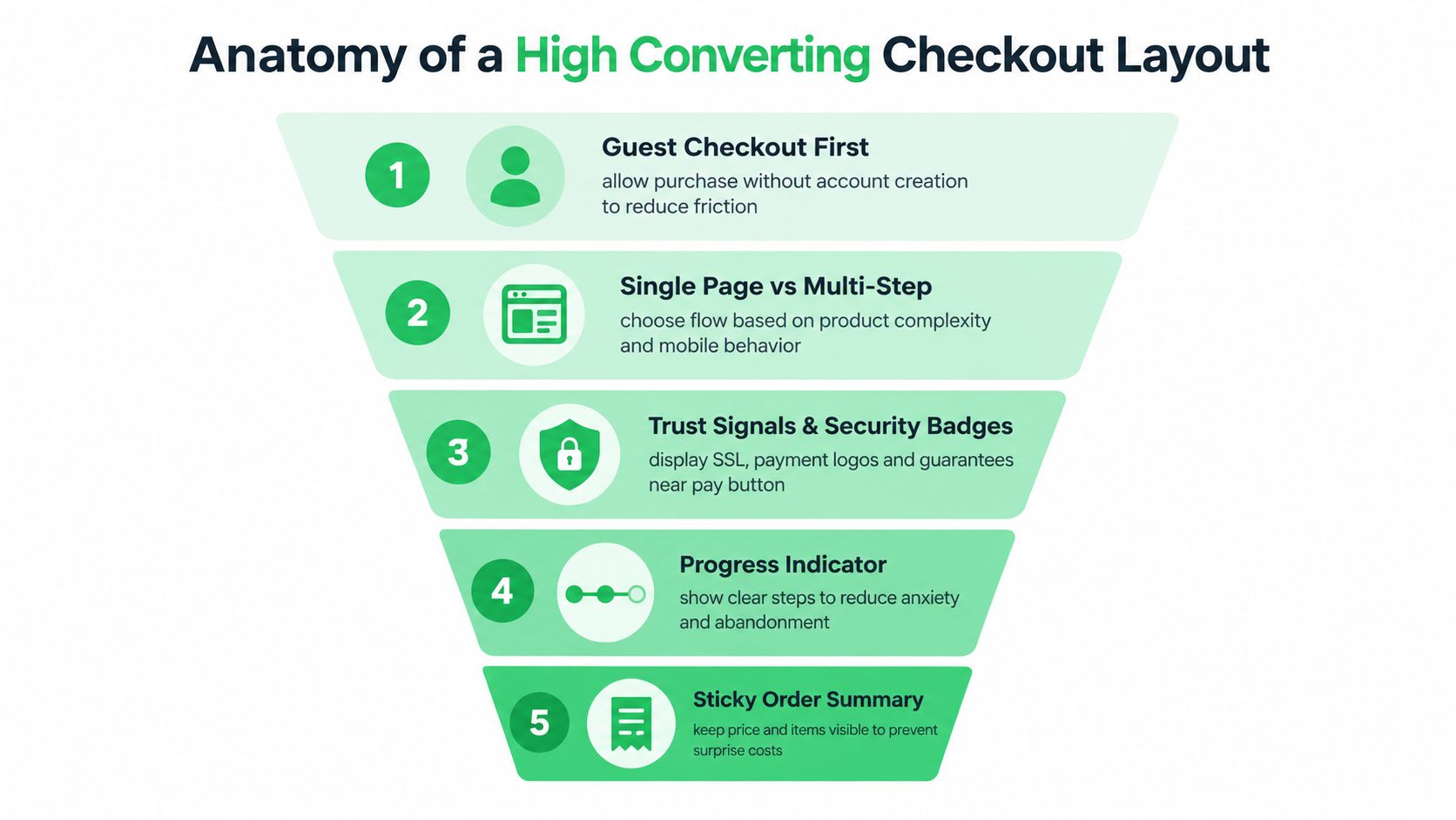
High-converting checkout layouts look controlled. They keep attention on completion, surface the fastest payment path early, and remove anything that creates a second thought or a failed authorization.
Start with the shortest credible path
Guest checkout should be the default unless there is a real operational reason to block it. As noted earlier, forced account creation is a known abandonment trigger. If subscriptions, member access, or post-purchase self-service matter to the business, take the order first and create the account after payment or with a simple password prompt on the confirmation page.
The one-page versus multi-step decision should come from payment behavior, not design preference alone.
Use one page when:
- The offer is simple: Single-SKU carts and low-configuration offers usually convert better with one uninterrupted flow.
- Wallet demand is strong: Apple Pay and Google Pay perform best when they appear before the shopper commits to typing.
- The team can control density: Collapsed sections, clear grouping, and one obvious pay action keep a one-page flow usable.
Use multi-step when:
- The order has real complexity: Shipping logic, tax collection, age checks, or B2B billing can justify separation.
- You need tighter sequencing: In some categories, separating delivery and payment reduces errors and lowers support contacts.
- State handling is reliable: Back navigation cannot wipe addresses, selected methods, or promotion data.
The trade-off is straightforward. One page reduces clicks. Multi-step can reduce cognitive load and contain failure points. The better choice is the one that gets more shoppers to an approved payment with fewer retries.
If you're weighing architecture trade-offs, this guide to one-page checkout design patterns is a useful reference.
Reduce fields before you redesign anything
Field count is still one of the fastest checkout wins. As noted earlier, many teams ask for more inputs than fulfillment, fraud review, or payment processing require.
Use a field audit before touching colors, spacing, or button copy:
- Delete fields with no operational value. Company name, title, second address line, and duplicate phone collection often stay in place because no owner removed them.
- Combine inputs where it helps completion. Full name usually performs better than splitting first and last name.
- Set sane defaults. Billing same as shipping should already be selected when that is the common case.
- Reuse known data. If email was captured upstream, prefill it.
- Collect risk data selectively. Ask for more only when the order, issuer response, or fraud model justifies it.
Checkout design becomes payment orchestration. Every unnecessary field creates another chance for autofill failure, AVS mismatch, validation friction, and cardholder drop-off. Cleaner data entry also helps approval rate because the transaction reaches the PSP with fewer preventable errors.
Keep the order summary visible too. Buyers need to confirm product, quantity, shipping context, taxes, and final total without hunting around the page. Cost clarity affects conversion, but it also affects chargebacks. If the summary hides recurring terms, shipping costs, or fulfillment timing, expect more post-purchase disputes and more pressure on your VAMP exposure.
Place trust where anxiety happens
Trust elements work best near the point of commitment. Put them next to payment entry and close to the primary action.
Use cues that match the shopper's concern in that moment:
- At payment entry: Card brand marks, secure checkout language, and a clean visual container around the payment section.
- Near the pay button: Return policy, renewal terms, delivery expectations, or refund language when those details influence the purchase.
- In the order summary: Final total, shipping method, taxes, and any subscription disclosure.
Good checkout pages also get quieter as the shopper gets closer to payment. Remove full site navigation. Cut low-priority links. Treat coupon fields carefully, because they often send ready-to-buy users off-site to search for codes they never intended to use.
One more operator point matters here. Payment method placement is part of layout strategy, not a separate systems decision. If wallets are buried, they do not get used. If card entry is the only visible option, shoppers who would have completed through a wallet, local method, or alternative PSP route never reach the best path. The strongest layouts support approval rate, method mix, and dispute prevention at the same time.
A practical walkthrough helps here:
<iframe width="100%" style="aspect-ratio: 16 / 9;" src="https://www.youtube.com/embed/TFwJYscOgoI" frameborder="0" allow="autoplay; encrypted-media" allowfullscreen></iframe>
Mobile First Checkout That Works on Real Devices
Desktop mockups hide a lot of mobile checkout failures. The problem usually isn't that the layout “isn't responsive.” The problem is that the checkout behaves differently on iOS Safari, Android Chrome, and Samsung Internet, and those differences decide whether buyers can finish without friction.
Design for touch, wallets, and autofill
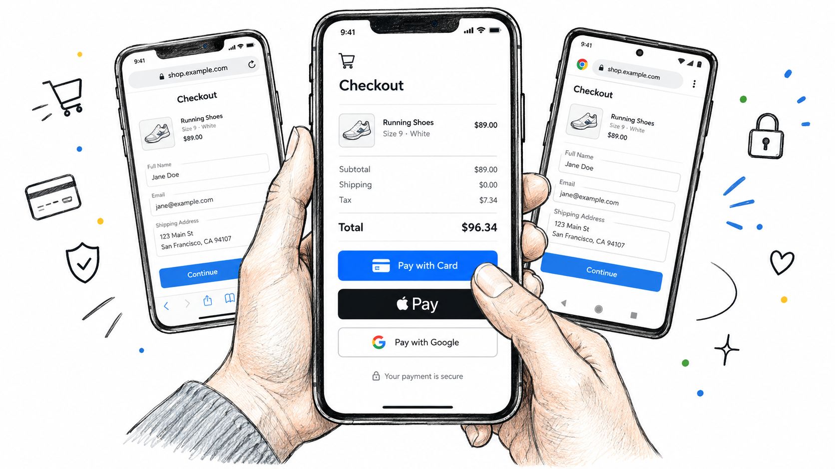
Recent mobile checkout guidance highlights that one-page guest checkout, autofill, and Apple Pay or Google Pay above the form can lift conversion by 8 to 15%, and it points back to the broader checkout opportunity created by Baymard's abandonment baseline and usability findings (mobile checkout behavior guidance).
That tracks with what operators see in production. The biggest mobile gains usually come from shrinking the amount of typing and putting the fastest payment path first.
Three things matter most:
- Wallet placement: Put Apple Pay and Google Pay above the standard form when the device supports them.
- Keyboard matching: Numeric fields should trigger numeric keyboards. Email fields should trigger email keyboards.
- Input compatibility: Native-friendly inputs outperform heavily customized fields that break browser autofill.
Real-device QA catches what staging misses
A mobile checkout can look fine in a browser emulator and still fail in the wild. Apple Pay may not render because domain verification wasn't completed correctly. Address autocomplete may fail because a custom input component blocks native autofill. Card scanning may work on one device family and behave inconsistently on another.
Test on the actual browser and operating system mix your customers use, not the devices your team prefers.
That means checking:
- iOS Safari: Wallet visibility, address autofill, SMS code handling, and viewport stability when the keyboard opens.
- Android Chrome: Google Pay rendering, browser autofill behavior, and keyboard overlap on long forms.
- Samsung Internet: Input masking, select menus, and sticky CTA behavior.
Mobile hierarchy needs different priorities
A good mobile checkout isn't just a compressed desktop page. It uses a different reading order. Payment shortcuts come first. Summary details collapse but stay accessible. The main action stays thumb-reachable. Error messages appear inline and close to the field that needs fixing.
The common failure mode is trying to preserve every desktop element. On phones, restraint wins. A stripped flow with one dominant action and one fallback payment path usually beats a visually rich layout with too many competing choices.
Payment Methods and Smart Routing Without Adding Friction
Payment methods are often presented as a merchandising decision. In practice, they're part of conversion architecture and approval strategy. The wrong method mix loses buyers before they submit. The wrong routing logic loses them after they submit.
Baymard notes that 21% of sites still accept only one payment method, while broader payment research shows cards remain the top online payment choice and digital wallets are second (Baymard cart and checkout research collection). That's the design mistake behind a lot of hidden revenue loss. Stores focus on button styling while the actual payment path is too narrow.
Choose the visible default, not just the available options
Most checkouts shouldn't show every payment method with equal weight. They should surface the best default for the buyer's context and keep the rest available without clutter.
Here's a practical decision matrix.
| Shopper Context | Default Method to Surface | Routing Tactic |
|---|---|---|
| Mobile shopper on supported Apple device | Apple Pay | Send wallet transactions through the processor with the strongest wallet stability and fallback to card entry if unavailable |
| Mobile shopper on supported Android device | Google Pay | Prioritize the PSP with consistent tokenized wallet handling and preserve form state if fallback is needed |
| Desktop buyer in a card-first market | Credit or debit card | Route by approval performance and processor uptime, with secondary PSP failover on soft issues |
| Returning subscription customer | Stored card or network token | Use retry logic that respects network rules and moves intelligently across available processors |
| International shopper with clear local preference | Relevant local method or wallet | Route locally where possible and avoid forcing a card-first flow when behavior says otherwise |
For merchants comparing platform and gateway capabilities, this overview of payment integration for ecommerce is worth reading because it frames integration choices in operational terms rather than just feature checklists.
More payment methods can help, but they can also clutter
Baymard's abandonment data already tells us that missing payment methods pushes some buyers out. But adding everything to the page can create a second problem. Too many equal-weight options slow decisions and distract from the primary path.
What works better is selective exposure:
- Show the most likely method first.
- Put accelerated wallets above the form on supported devices.
- Group secondary methods behind clear labels, not vague “other” drawers.
- Keep the UI stable when a buyer switches methods.
If you need payment logic that adapts by device, region, processor health, or risk rules, dynamic payment routing becomes part of checkout design, not just back-office plumbing.
High-risk and subscription brands need routing discipline
Payment processing and ecommerce checkout page design fully overlap. High-risk brands can't optimize for front-end conversion alone. They also need to protect account stability, processor relationships, and network compliance.
Visa's merchant monitoring rules changed materially on 1 April 2026, with the VAMP excessive threshold dropping from 2.20% to 1.50% across the US, Canada, the EU, and APAC (Visa threshold change coverage). That matters because aggressive acquisition plus weak billing controls can turn a “converting” funnel into a processor problem fast.
For subscription billing, retry logic is even more sensitive. Visa guidance states that retrying a hard decline more than once in 30 days can trigger the Excessive Reattempts Program, and guidance caps retries at 15 attempts in 30 days for a given card-merchant combination. Coverage also notes penalties can start at $25 per excess attempt (Visa decline retry guidance).
That's why routing should include:
- Soft decline recovery: Move to the next sensible path without hammering the same failing route.
- Hard decline suppression: Stop quickly and trigger dunning or customer messaging instead.
- PSP-aware fallback: Shift traffic when a processor degrades, but don't create duplicate attempts that raise risk.
I'd also put tools in this category. Systems like Stripe, Adyen, NMI, and orchestration layers that unify checkout with routing can support this model. Tagada is one example. It combines checkout control with multi-PSP routing, subscriptions, dunning, and payment-event triggers in one layer, which is useful when the front end and the payment stack need to react together.
Performance Error Handling Tracking and Accessibility That Protect Conversion
A checkout can look clean, offer the right methods, and still lose orders if the underlying system fails under pressure. The invisible work matters here. Performance, validation, event tracking, and accessibility protect the conversion you've already earned.
Reliability starts before the payment attempt
Baymard's research says the average large ecommerce site can increase conversion by 35.26% with better checkout design, and it explicitly recommends removing unnecessary fields, prefilling known data, visually encapsulating payment inputs, and avoiding low-value data requests (Baymard PDF report). Those are usability actions, but they also improve technical reliability because simpler checkouts produce fewer edge-case failures.
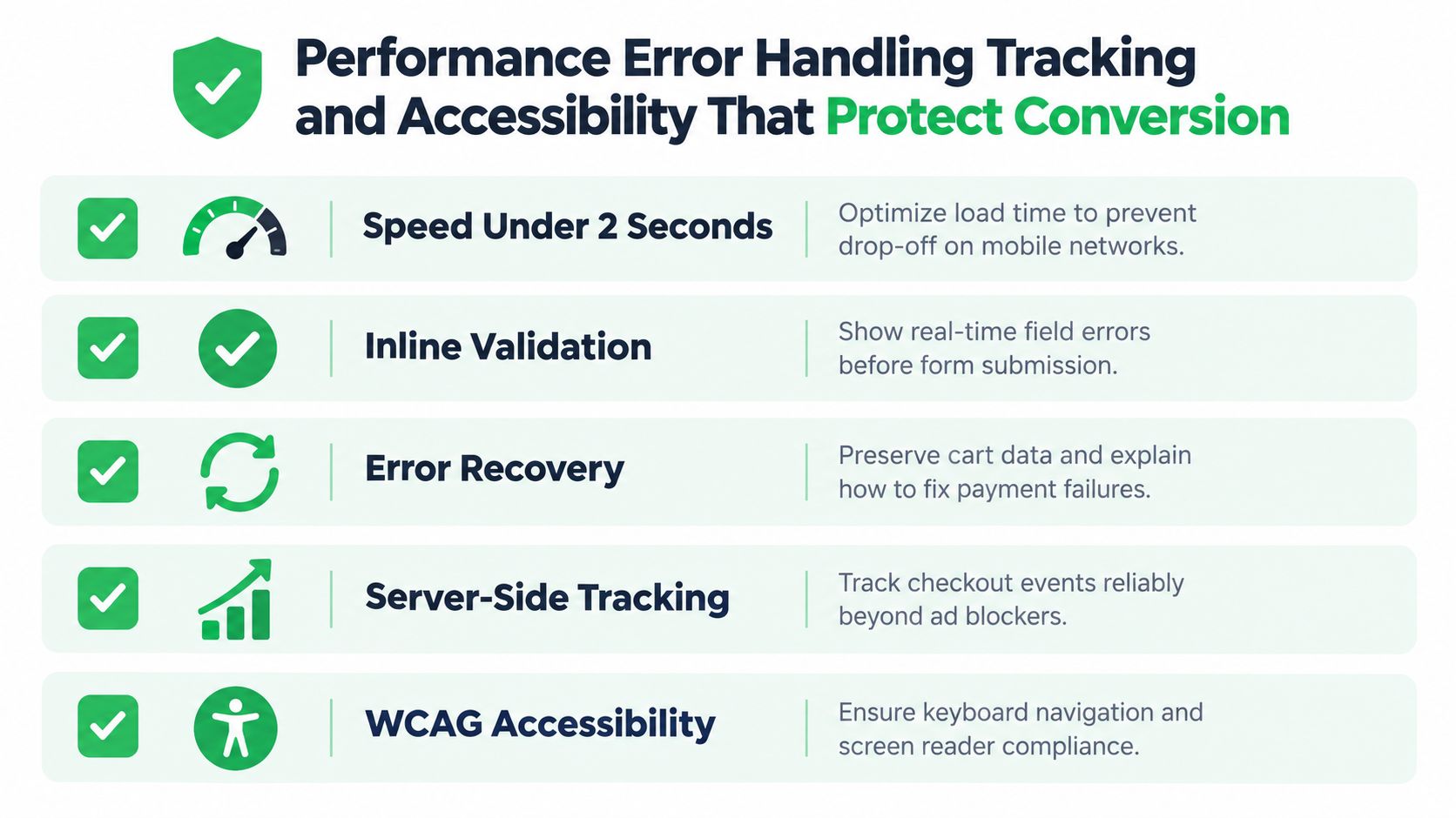
My standard checklist looks like this:
- Keep the path light: Every extra script, widget, and third-party dependency adds another way for checkout to break.
- Validate inline: Buyers should see field-level issues before the final submit, not after a full-page rejection.
- Preserve state: If payment fails, don't wipe the form or empty the cart.
- Explain the error: “Payment failed” is weak. Tell the buyer whether they should retry, use another method, or contact their bank.
A failed payment isn't always the end of the order. It becomes the end when the checkout gives the buyer no clear recovery path.
Tracking should survive blockers and failures
A lot of teams still evaluate checkout changes with incomplete tracking. Browser-side pixels miss events. Ad blockers suppress signals. Failed payment states often never get recorded in a way the growth team can use.
Server-side tracking fixes part of that. The key is tying checkout milestones to real payment outcomes, not just button clicks. You want to know where buyers drop, which processor handled the attempt, what error type came back, and whether the user recovered on the same session.
That's also why processor redundancy matters. If one PSP or gateway path degrades, a healthy setup can fail over without forcing the buyer to restart. This primer on payment redundancy and failover is useful if your current setup still treats processor outages as support issues instead of conversion issues.
Accessibility is conversion protection, not compliance theater
Accessible checkout design helps every buyer, not just users with formal assistive needs. Clear labels improve autofill. Visible focus states help keyboard navigation. Error text that doesn't rely on color alone makes failure states easier to understand for everyone.
Strong accessibility practice includes:
- Persistent labels: Don't rely on placeholders as the only field context.
- Keyboard support: Buyers should be able to move through the flow without getting trapped.
- Readable contrast: Buttons, totals, and error states need to remain clear under real-world viewing conditions.
- Screen reader logic: Field grouping and payment sections should make semantic sense.
High-risk and subscription merchants should add one more layer to this section: dispute-aware messaging. Billing descriptors, renewal terms, trial disclosures, and cancellation paths influence whether a completed order later becomes a chargeback problem. That isn't visible in the interface mockup, but it's part of whether checkout protects revenue.
Testing Launching and Continuously Improving Your Checkout
Checkout optimization works best when it runs like a production discipline, not a redesign project. You don't need endless experiments. You need a test queue tied to the highest-friction points in your own funnel.
Test the decisions that change buyer effort
The biggest wins usually come from changes that alter behavior, not styling. Start with things buyers directly feel:
- Path tests: guest checkout prominence, one-page versus multi-step, wallet placement.
- Form tests: field removal, default selections, autocomplete behavior, validation timing.
- Payment tests: visible method order, regional defaults, fallback rules after declines.
- Trust tests: placement of refund language, subscription terms, and payment reassurance.
If your team needs a structured framework for experiment design, this A/B testing guide for optimization is a practical reference for building hypotheses and reading results without overcomplicating the process.
Launch with an operator's checklist
Before you push changes live, verify the basics manually. I'd rather delay a launch than ship a prettier checkout with broken wallets or duplicate decline attempts.
Use a pre-launch pass like this:
- Fields: Confirm every required field is operationally necessary and behaves correctly with autofill.
- Wallets: Check Apple Pay and Google Pay on supported devices and browsers, not just simulator views.
- Methods: Verify each payment option renders in the intended market and flow.
- Error states: Trigger card declines, address mistakes, and empty-field submissions to inspect the recovery path.
- Tracking: Confirm checkout start, payment attempt, success, and failure events reach analytics and ad platforms correctly.
- Subscriptions: Review trial terms, rebill disclosures, dunning triggers, and cancellation messaging.
- Retries: Make sure failed rebills follow network rules and don't create avoidable excess attempts.
- Accessibility: Tab through the flow, test visible focus, and check label clarity on every input.
Improvement should connect conversion and approval
The smartest teams don't isolate checkout conversion from payment outcomes. A test that increases submit rate but sends more traffic into a weak processor path may look good in the UI dashboard and bad in net revenue. The same goes for subscriptions. A more aggressive retry strategy can make short-term recovery look better while increasing risk with networks and processors.
The right operating model is simple: review completion rate, method mix, approval behavior, decline reasons, and post-purchase risk signals together. That's how ecommerce, payment processing, rebills, and high-risk control start working as one system instead of four disconnected teams.
If you run checkout that way, design decisions stop being subjective. They become measurable revenue decisions.
Tagada gives merchants one orchestration layer for checkout, payments, messaging, and growth, so the page design, payment routing, server-side tracking, and subscription recovery logic can work together instead of fighting each other. If you want a checkout stack that connects conversion with approval rates and operational control, visit Tagada.